One of the best things about launching your own magazine is being able to do all the things that you’d usually have to fight really hard for.
One of the BIG RULES of editorial design is consistency. But like all good design rules, they are there to be broken. The challenge I love is to change things while keeping our personality. When you see an issue of Pit, you know it’s Pit even if it has a different font.
Every issue of Pit is themed, so I like to theme the art direction of each issue to touch on that, too. There are a lot of elements I keep the same, like the body typeface and the grid, plus I have a way I like to do things, which does give each issue a feel. But within my ‘kit of parts’ is a constantly evolving archive of silly typefaces I am desperate to use. They are almost always rounded in some way; it turns out that rounded typefaces are generally hated by clients but loved by me.
Don’t forget that you can subscribe to the printed magazine to see our explorations into different themes. You do not get the full impact without seeing them in print. Trust me!
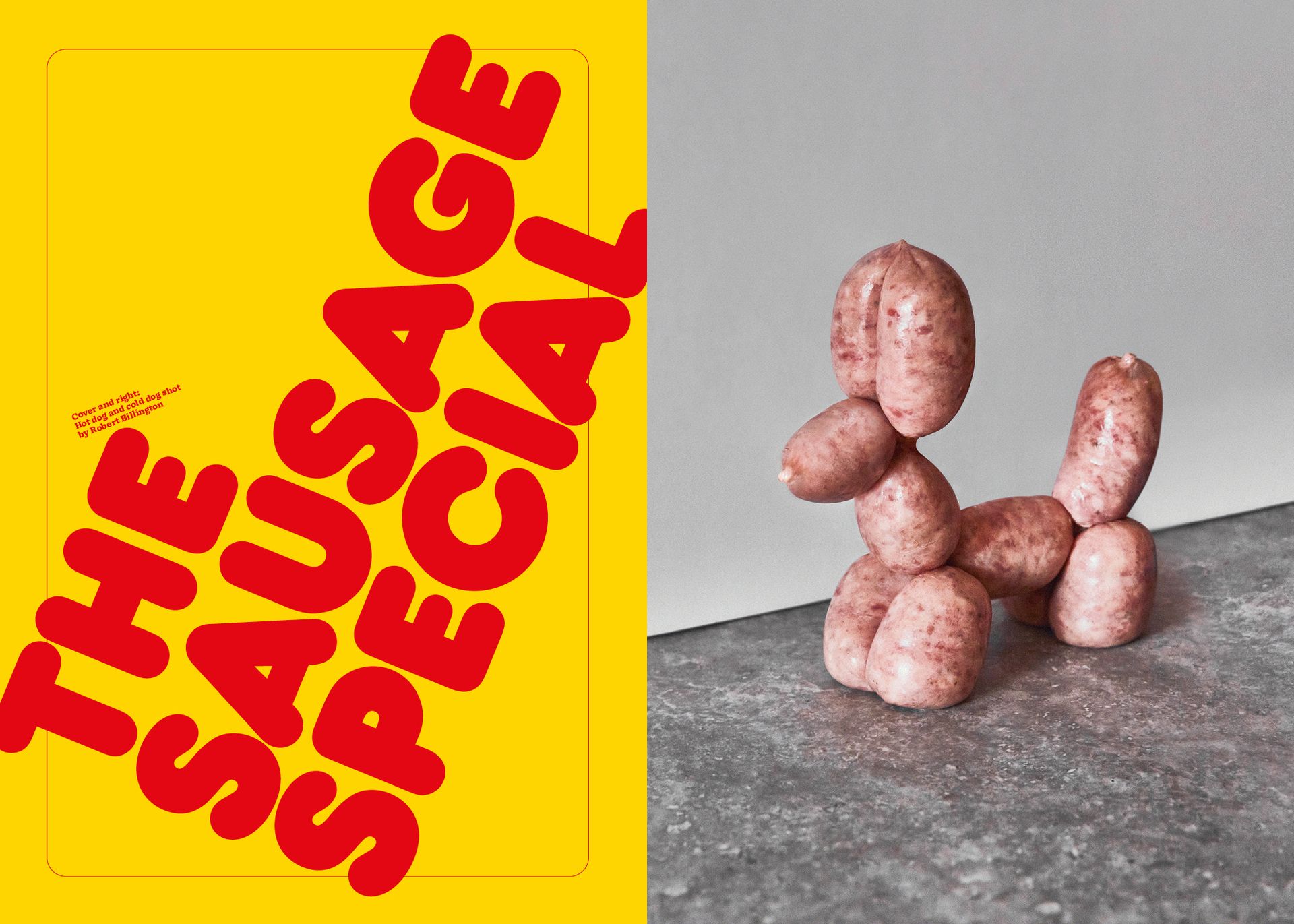
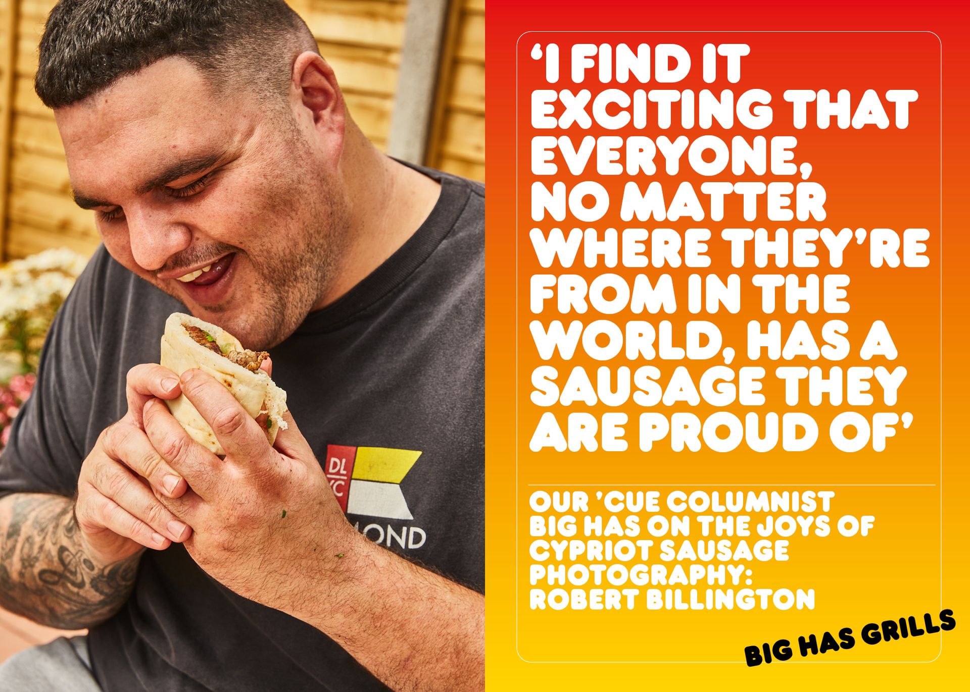
Issue 08 - the sausage special
Frankfurter
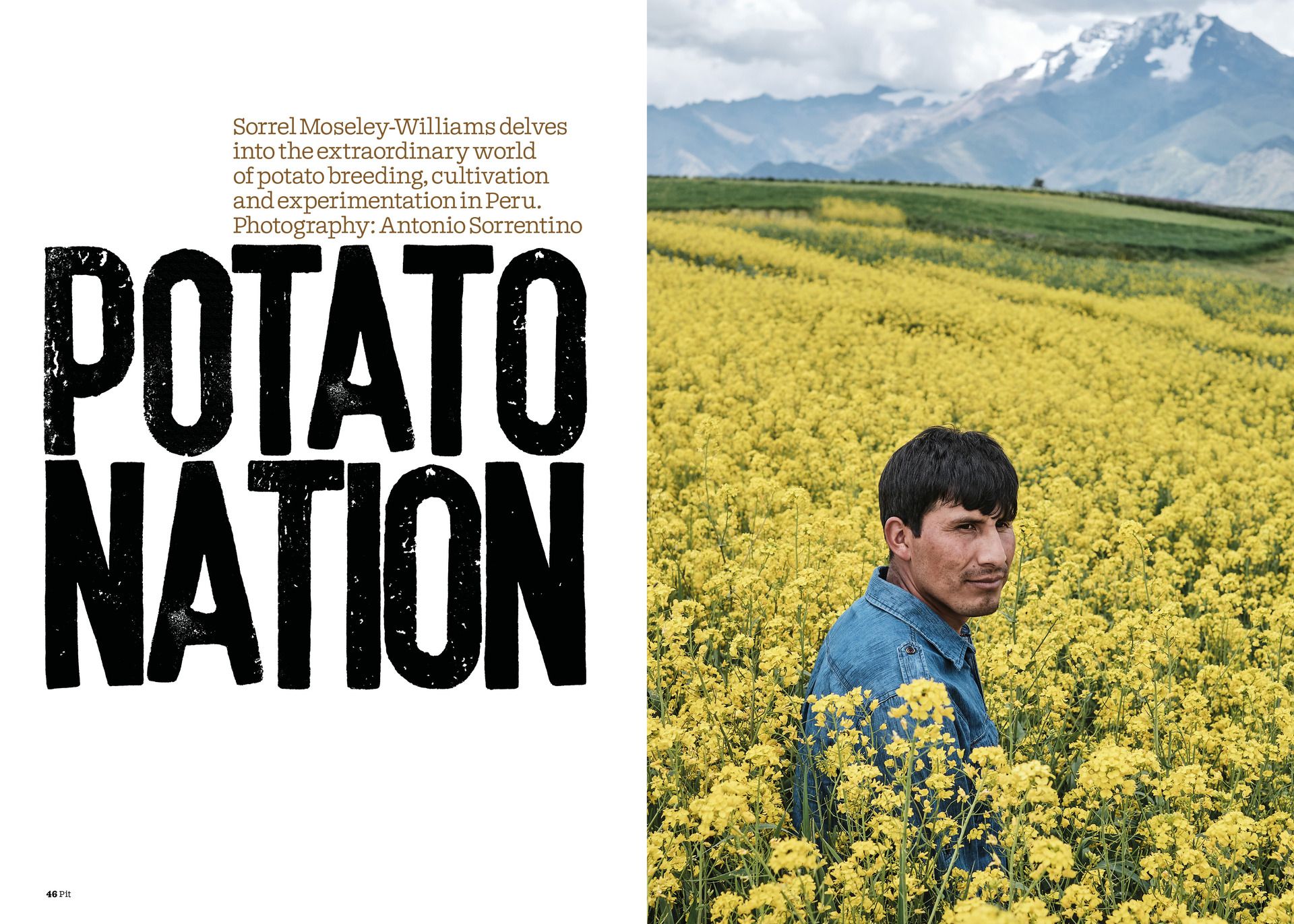
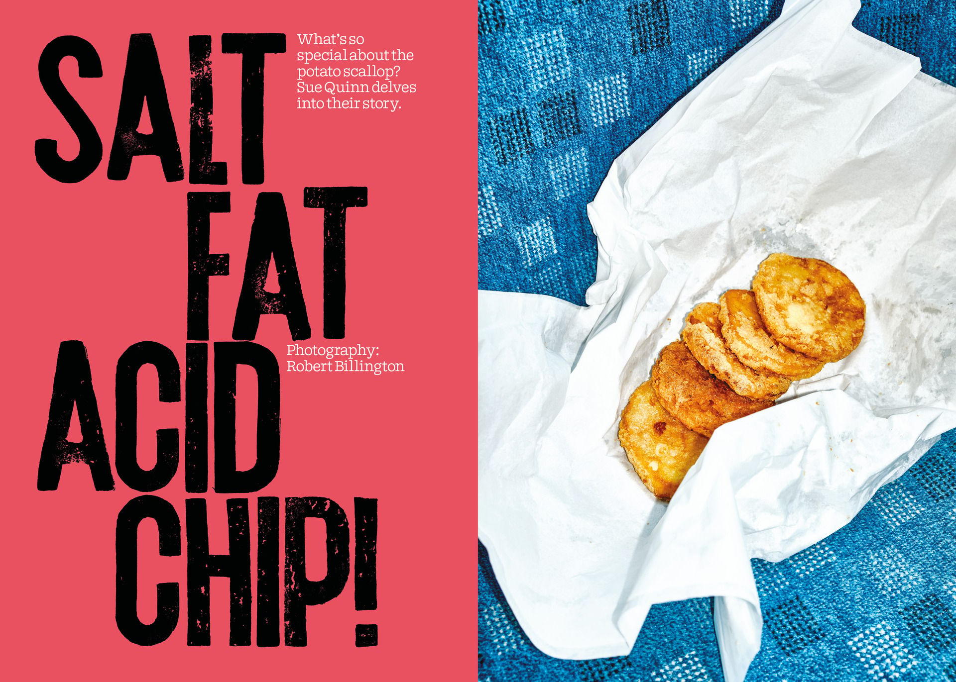
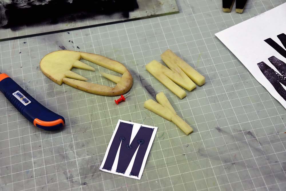
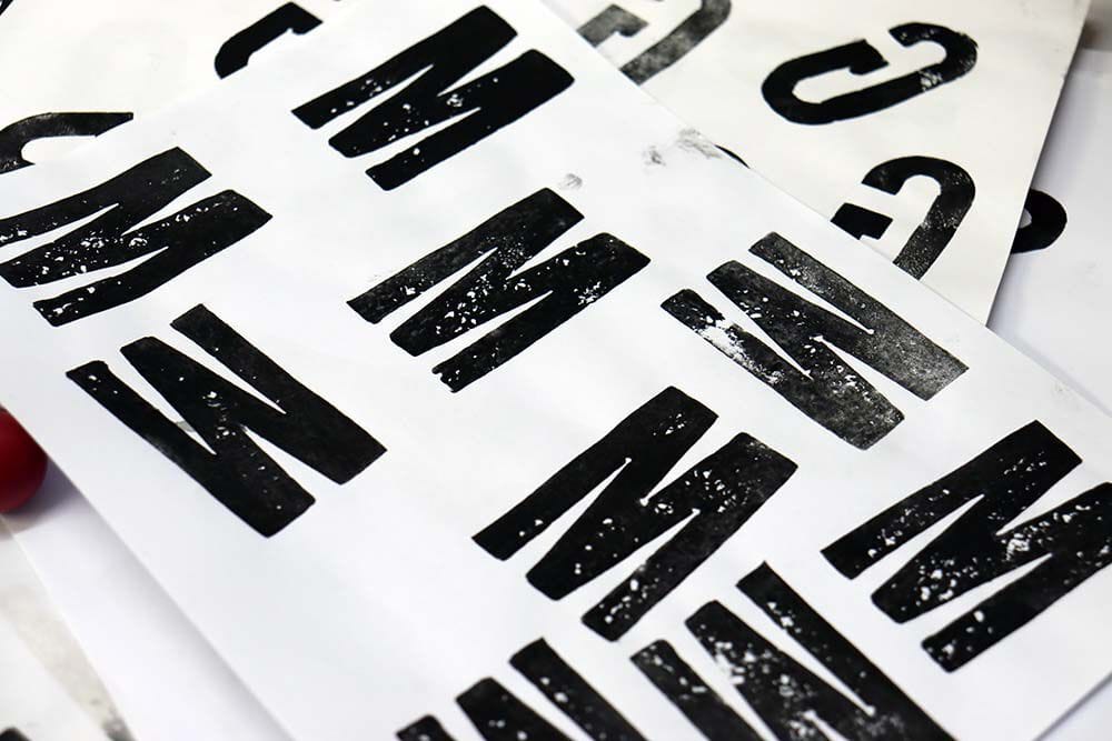
Issue 12 - the potato issue
Potato printed type by Will Mower
This was actually our first and (so far) only commissioned typeface. It was designed and printed by the wonderful, lovely and talented Will Mower. Will is a printmaker and graphic designer. When we decided that we wanted to do the potato issue, the first thing I did was email him.

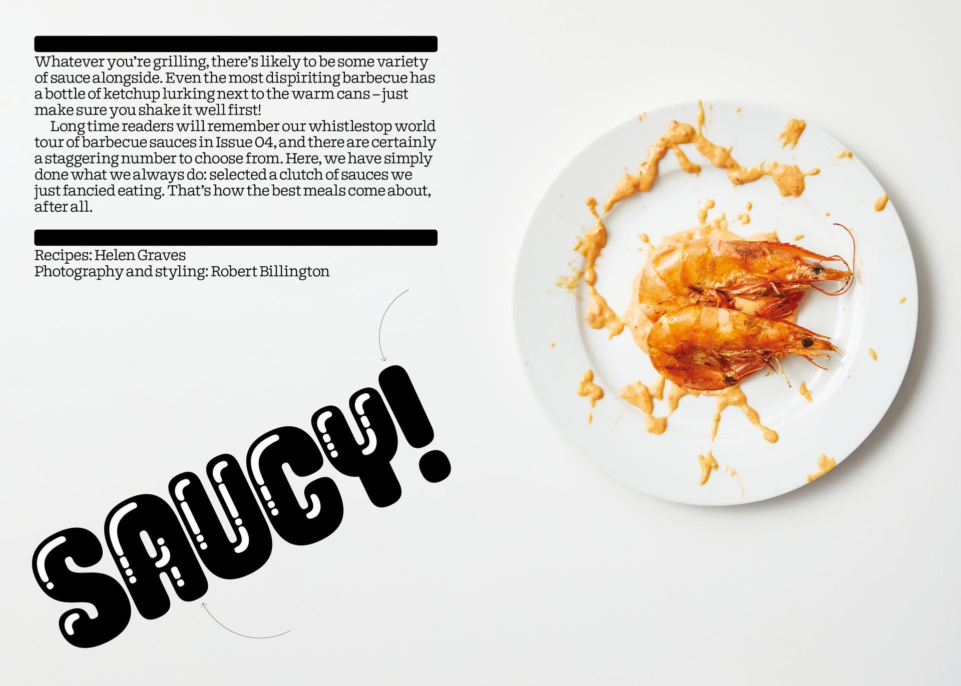
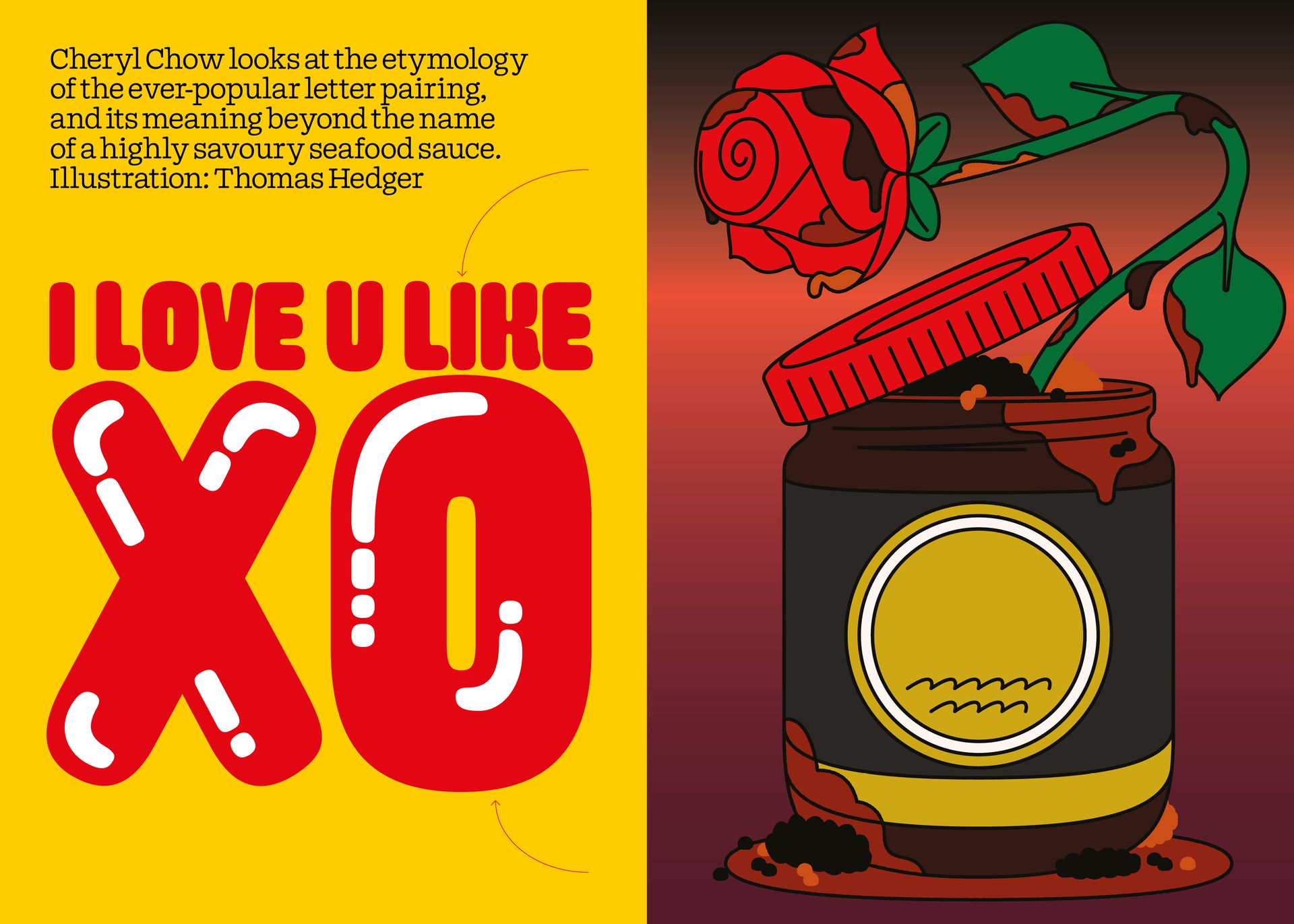
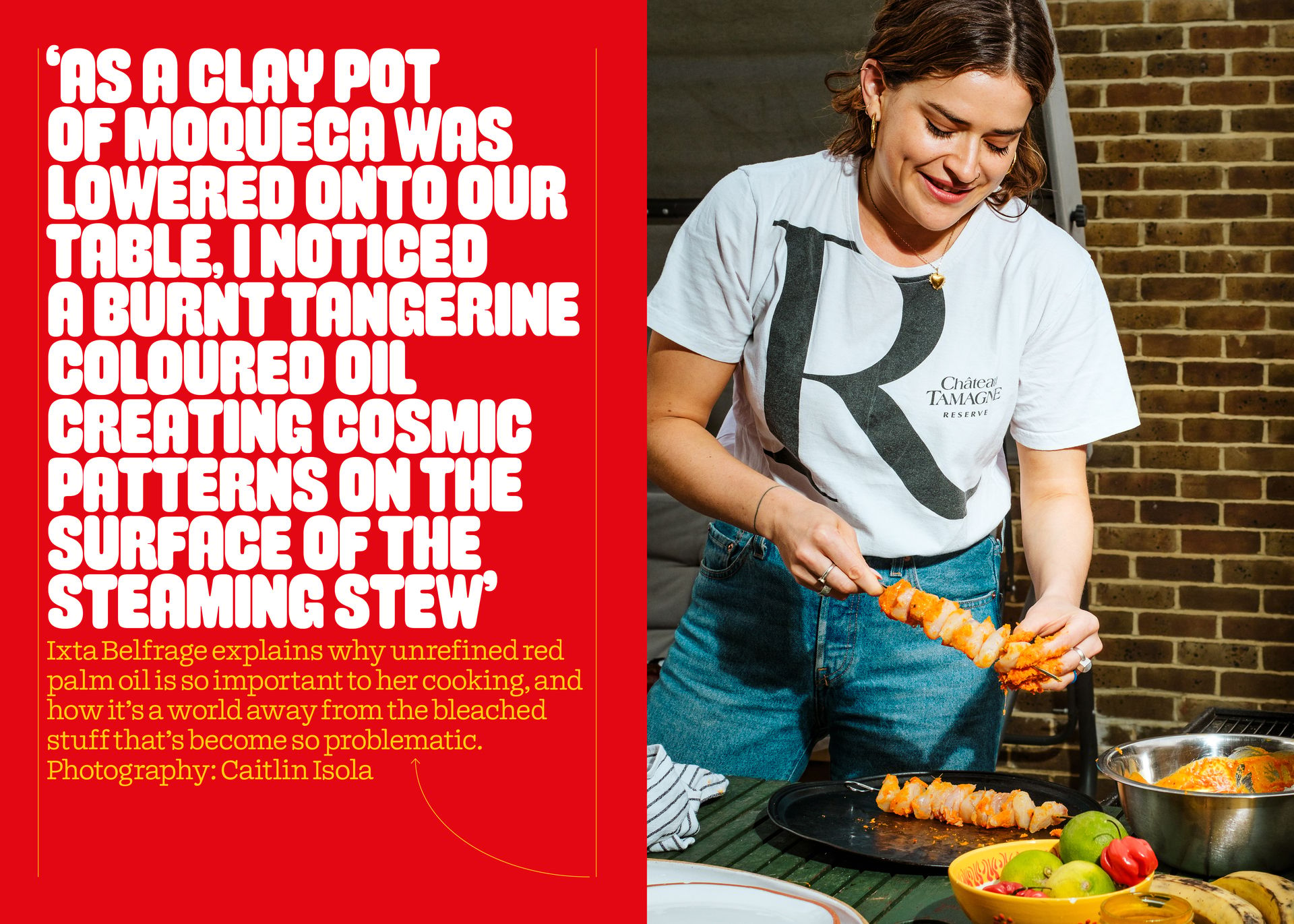
Issue 13 - saucy issue
Mayonnaise by Spaghetype
The name says it all, really.
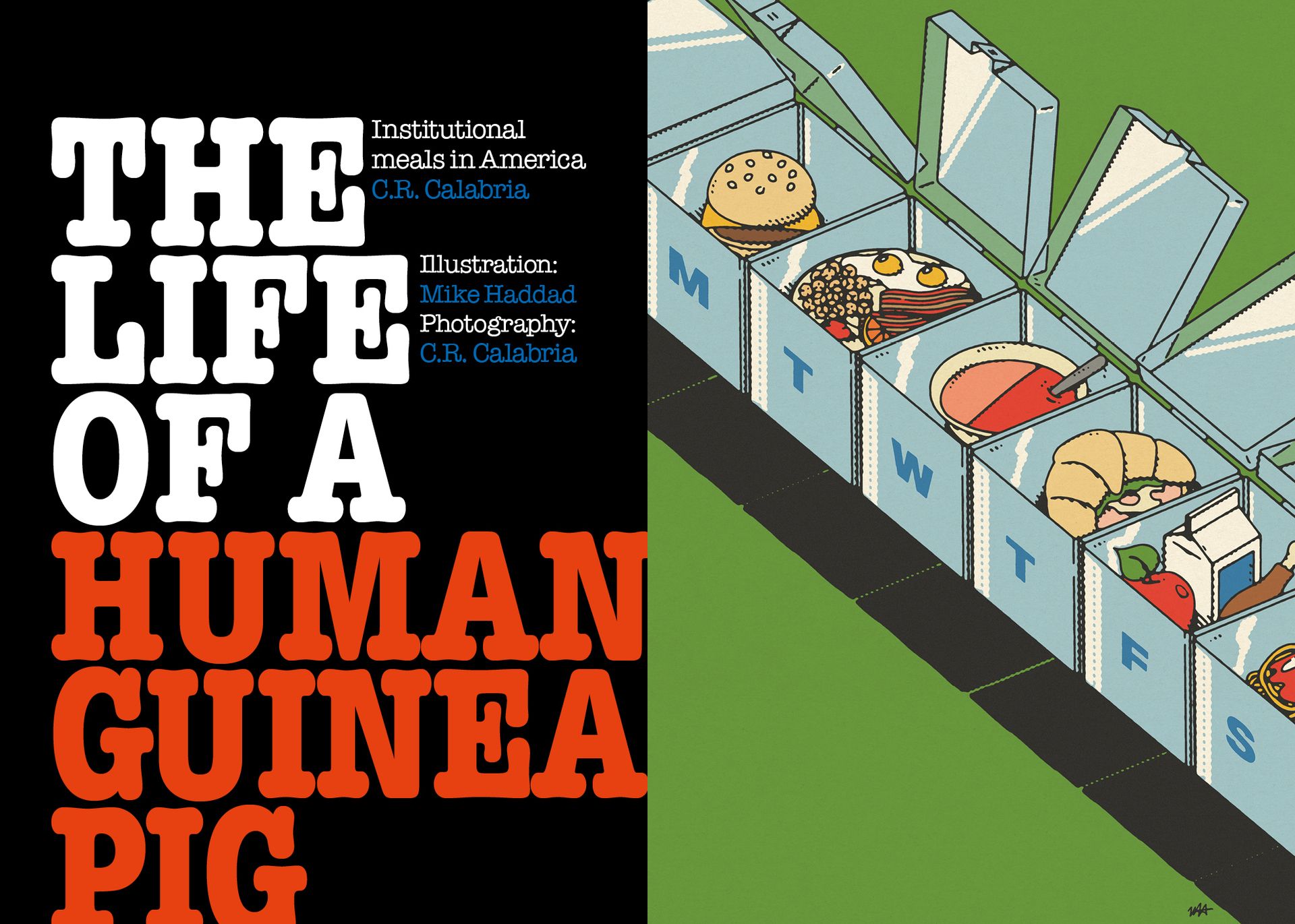
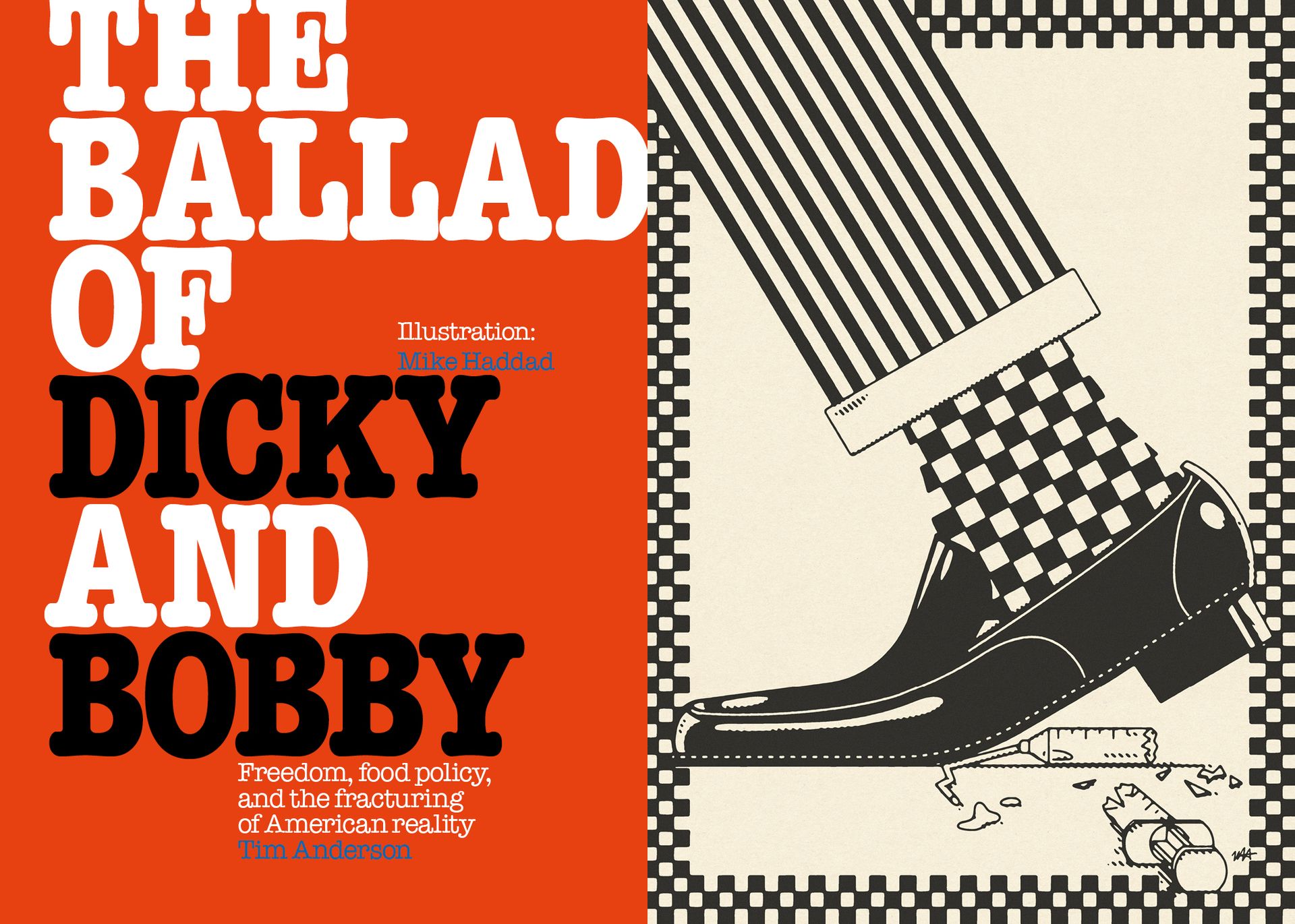
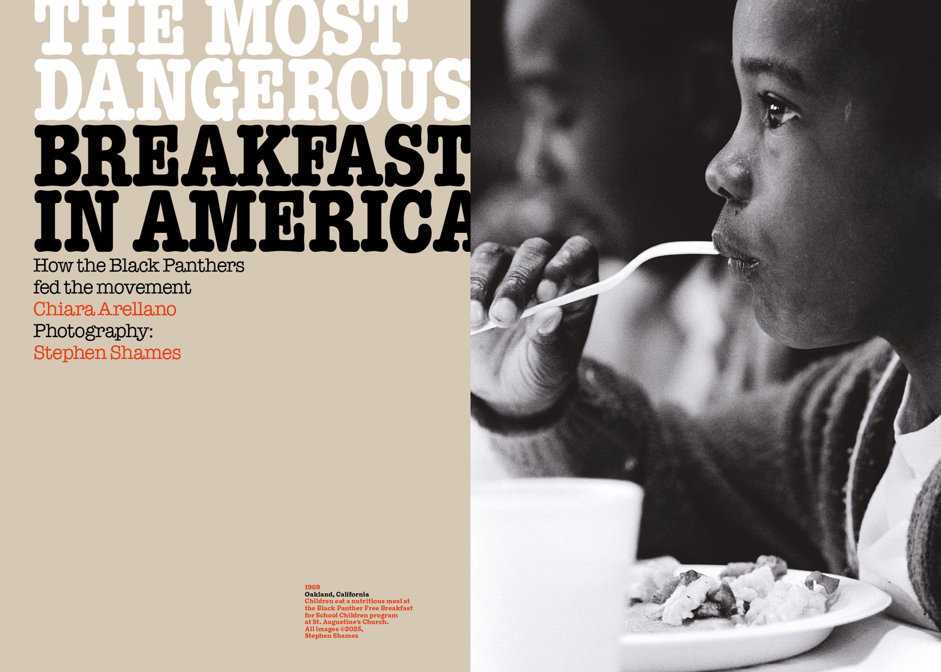
Issue 16 - America!
American Typewriter Condensed
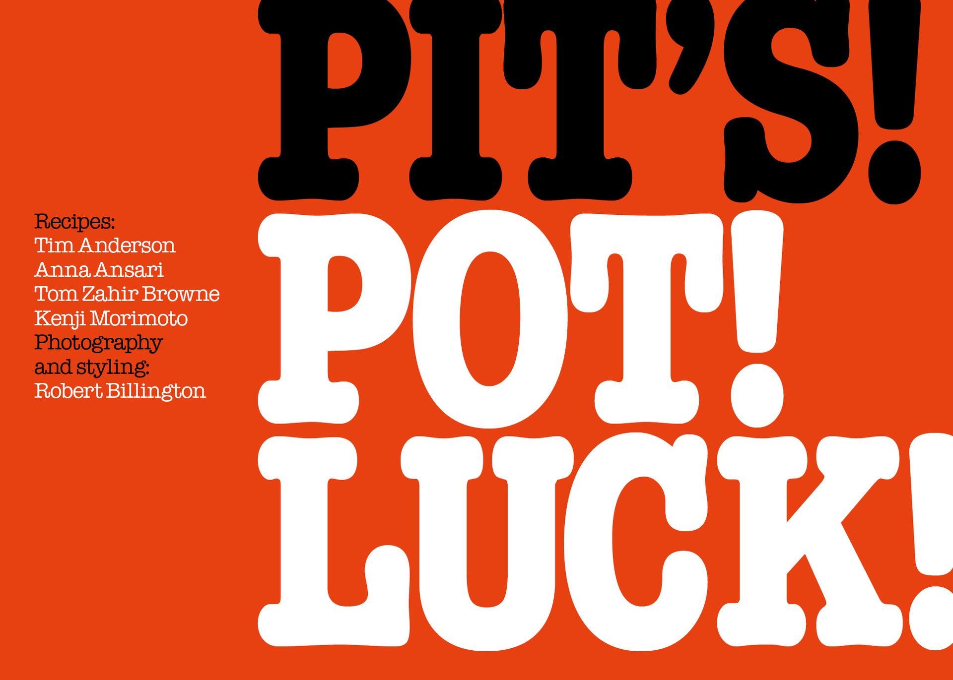
ALL ISSUES
OUR ONE TRUE TYPEFACE
DOYLE - Sharp Type
So good I have it tattooed on my wrist. Designed by Lucas Sharp and Marc Rouault at Sharp type. It’s the beautiful child of Cooper Black and American typewriter, and the perfect Pit typeface.

MSG cover
Thanks for reading!
Holly x

